Lighting
Diary Entry:
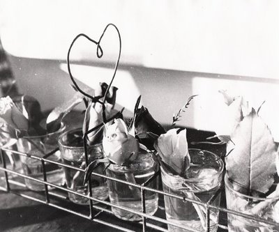
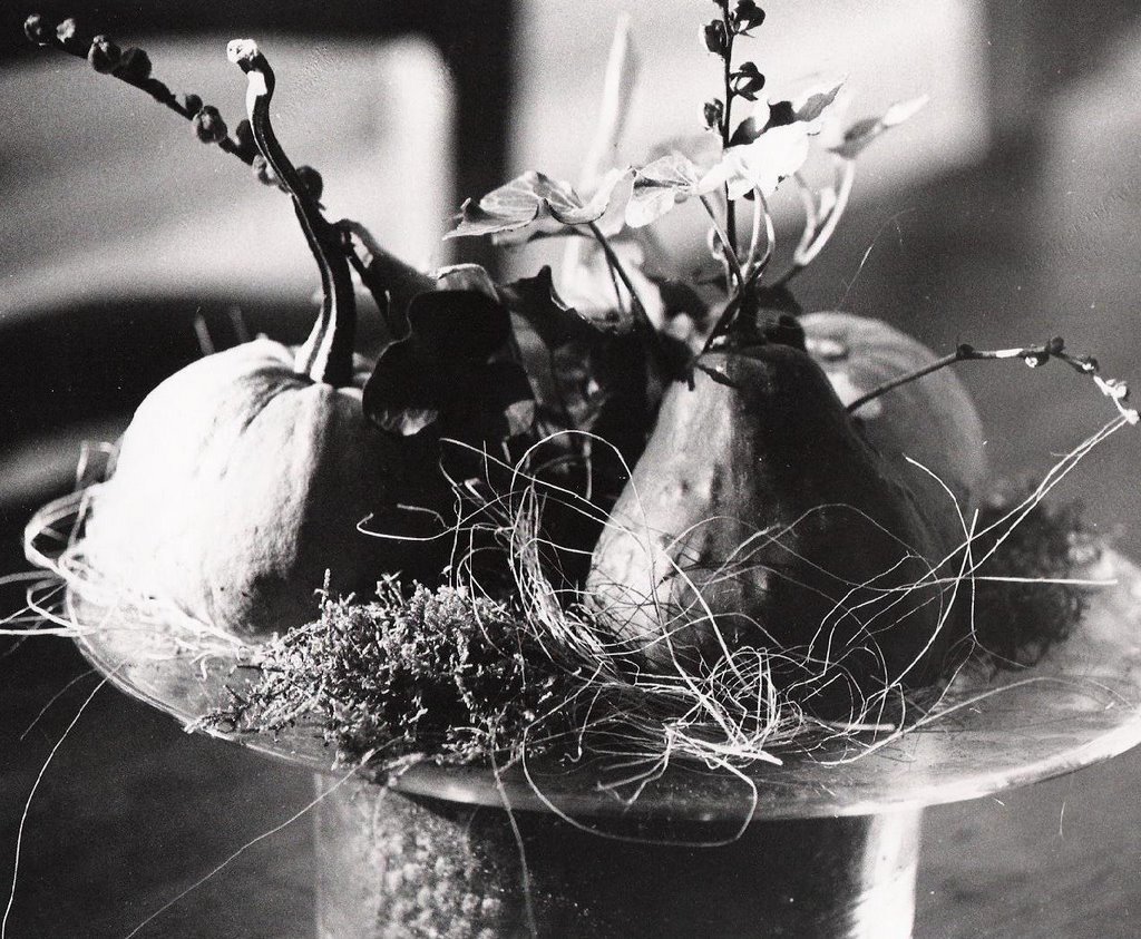
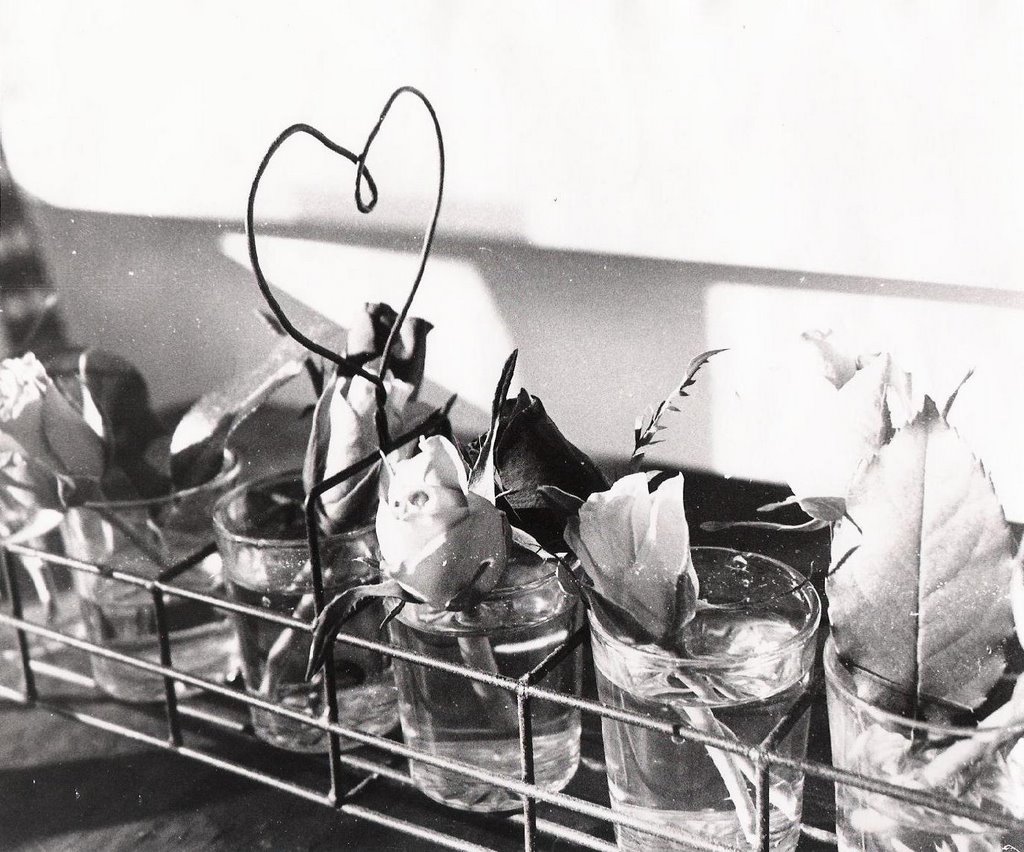
During this project I didn't have many problems in the darkroom. I had to get accustomed to my new work station, which is in a darker place than mine from last year. My negatives were very good for the most part, so I didn't have many problems printing my pictures. On my first portrait, I worked with the picture to get more texture and to balance the contrast, and I ended up using a low filter. For my second portrait I had a "chemical problem". Strange ripples and dots appeared on my negatives, and there was no way to get rid of them. I printed the picture nonetheless, and It came out fine (It's better to look at it from a distance). For this picture and the next 2 also, I used a very high filter (4.5) to get the effect and the contrast that I needed. I loved the contrast that I got in the first portrait (pumpkin centretable) and the second portrait (roses centretable). For these last two I basically used the same settings as the ones before, just adjusting the aperture and increasing the time.
For the landscapes I worked with a medium filter and very different apertures: 11 for the morning shot and 2.8 for the evening shot. I loved all these prints and was very satisfied with my improvement from last year. Overall, everything in the darkroom ran smoothly, even though I had to get used to waiting longer for prints to go through the developing process, since we were using fiber-based paper. The advantage of this paper was that by monitoring how long a print stays in the developer, you could make an image darker or lighter, and this quality of the paper really helped the contrast on my prints!
Theory Notes:
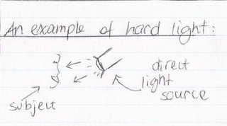
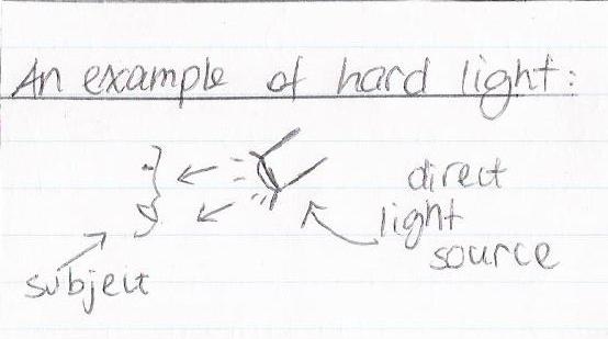
Hard Light:
Hard light is light that is pointed directly at the subject. There will be dark shadows because of it, and it will usually create a lot of contrast in the picture, because only part of the subject will me illuminated. This creates a very dramatic effect, that can be manipulated by the photographer to create a picture that looks strong or angry.
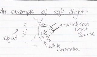
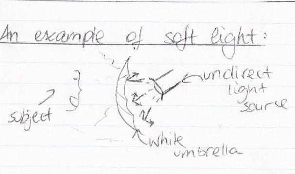
Soft Light:
Soft light is light that has been diffused or it is indirect. Soft light is used when you want the subject to be lit more evenly, and less shadows (less defined) will be created. Because of this, the image will appear softer, and less texture will be shown, so less imperfections will be seen.
Three-Point Lighting:
Three-point lighting is when you combine hard light and soft light to create a natural effect. It is used a lot by professionals, and it consists of one hard (key) light that points directly at the face, a diffused (fill) light that softens up the picture by making imperfections less detailed, and a backlight, that is placed behind the subject so that they will appear more separated from the background.

http://www.cybercollege.com/
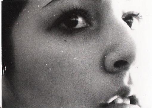
As you see, the subject is in front of the backlight and behind the hard and soft lights.
The following is an example of a picture taken with three-point lighting:

http://www.cybercollege.com/
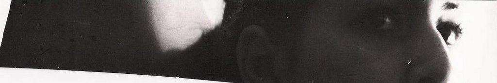
As you see, the light is distributed evenly but it is not too soft, and the subject stands out because of the back light.
Printing Compositions: *click on images to inlarge them*
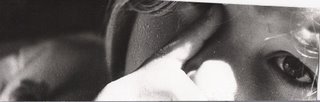
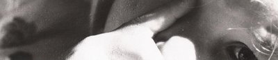
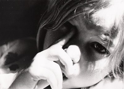
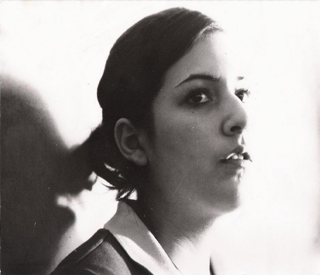
Portrait I: hard light
The main challenge with this print was getting enough detail without losing the special effect that the hard light gave. I started out with no filter and an 8 aperture (test strip 1), but the pictures looked milky and not detailed enough. The contrast was fabulous with the more open apertures, like 5.6 (t.s. 2), but the picture overall was too dark and still not detailed enough. So in the end I kept the 4 filter and the 8 aperture, with a time of 20 seconds (print 1).
test strip 1: A:8 ; T:10 ; F:none
test strip 2: A:5.6 ; T:26 ; F:4
print 1: A:8 ; T:20 ; F:4

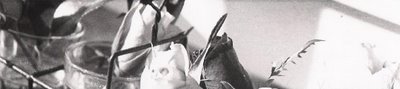
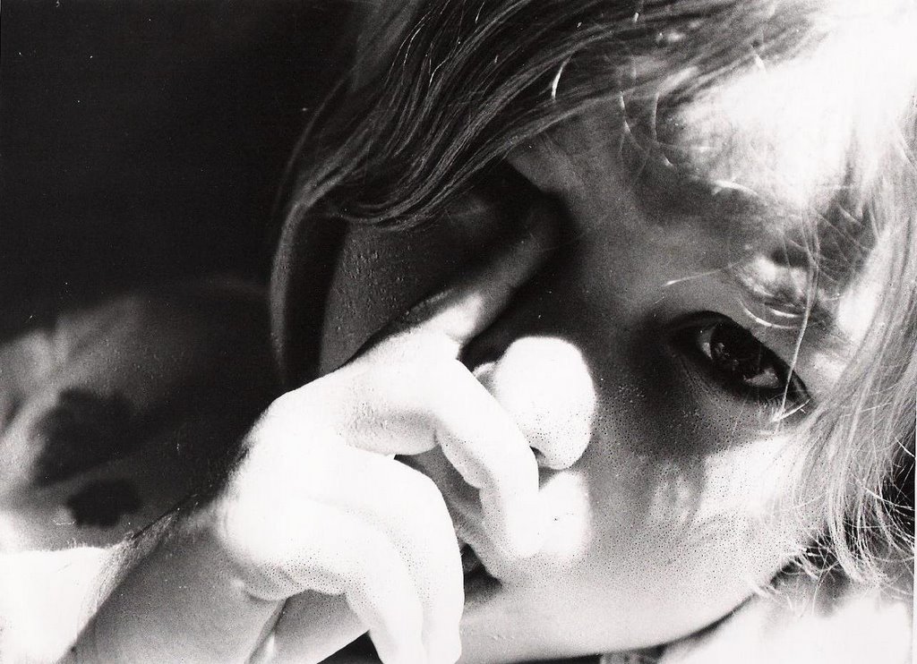
Portrait II: natural light
This portrait had strange dots and ripples that I was unable to take out. I worked with high filters to give her a more "stone" -ish appearance. I started out with an 8 aperture and a medium filter (test strip 3), which gave me quite a nice image, but too "soft" and somewhat light. I tried to go darker, but still I wasn't satisfied with the result, so I changed the filter to a higher one and played with the time (t.s. 4 and 5) until I got the perfect settings for my final print (print 2).
test strip 3: A:8 ; T:15 ; F:2.5
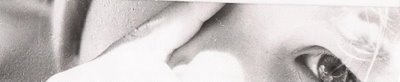
test strip 4: A:8 ; T:35 ; F:4.5
test strip 5: A:8 ; T:45 ; F:4.5
print 2: A:8 ; T:40 ; F:4.5
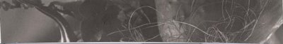
Still Life I: "hard" natural light
This print has "hard" light because of the striking contrast between the areas of light and no light, even though the lighting was natural. For this print, I wanted to have as much contrast as possible to show the amazing light effect. I started out with a 4 aperture and a low time (test strip 6) but I got something horribly grey and dark! So I closed the aperture to 8 and inserted a high filter (t.s. 7) but still the picture didn't have as much contrast as I wanted. To get this contrast I closed the aperture even more to 11, and tried different times (t.s. 8) until I realized that the best time was 45 seconds (print 3).
test strip 6: A:4 ; T:5 ; F:none
test strip 7: A:8 ; T:11 ; F:4.5
test strip 8: A:40 ; T:40-35-30 left to right ; F:4.5
print 3: A:11 ; T:45 ; F:4.5
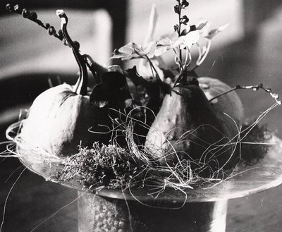
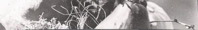
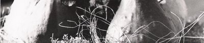
Still Life II: "soft" natural light
This print has "soft" light because the light is more evenly spread out among the subject, with no areas of total white or total black. The image seems softer because of this. For this print, I was again concentrating on contrast and detail. I started out with simial settings as the first still life, just a lower time (test strip 9), but the contrast wasn't very good. So I increased the time to 40 seconds (t.s. 10) and eventually decided to go to 45 seconds for my final print (print 4).
test strip 9: A:11 ; T:25 ; F:4.5

test strip 10: A:11 ; T:40 ; F:4.5
print 4: A:11 ; T:45 ; F:4.5
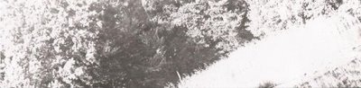
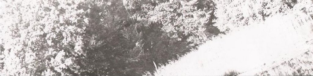
Landscape I: morning natural light
This picture was taken around 9 in the morning, which accounts for the long shadows seen in it. My main focus for this print was to have the right balance of whites and blacks, and therefore a good contrast. I started out with trying two different apertures, 4 and 8, and the same time (test strip 11). Neither of these was very successful, one being almost completely black, so I tried closing up the aperture and increasing the time (t.s. 12), but I still wasn't satisfied with the contrast. So I inserted a medium filter and went back to the 8 aperture (t.s. 13) and I was quite happy with the results, since I thought there was enough contrast. Therefore, for my final print I increased the time by two seconds and got a contrast which I was satisfied with, and an image which I thought represented the morning light well (print 5).
test strip 11: A:4-8 left to right ; T:20 ; F:none
test strip 12: A:11 ; T:25 ; F:none

test strip 13: A:8 ; T:18 ; F:2.5

print 5: A:8 ; T:20 ; F:2.5
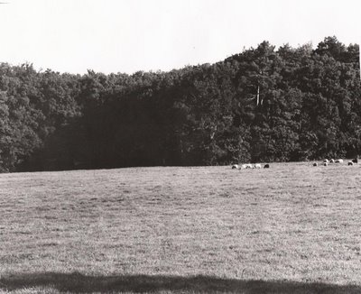
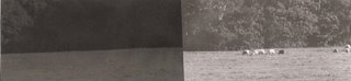
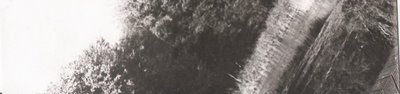
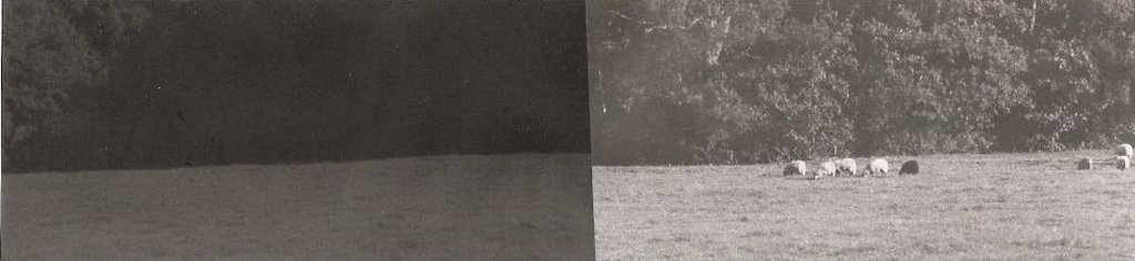
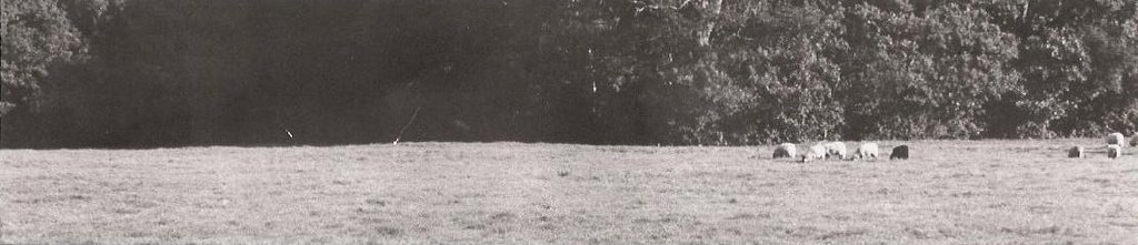
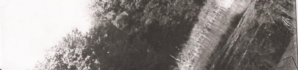
Landscape II: evening natural light
This picture was taken around 6 in the afternoon. You can see that the sun is low in the sky by noticing the shadows that the trees create. I was worried that this picture would be too dark, but in the end I was happy with the final print. I started out with the same settings as the previous landscape (test strip 14) but I got a picture with way too much white! So I opened up the aperture all the way, kept the same filter and tried different times (t.s. 15) to see if it would improve. For my final print I just increased the time a bit, to 15 seconds, and I was satisfied with the contrast beween the trees and the sky, and with the reflection on the trees in the lake (print 6).
test strip 14: A:8 ; T:20 ; F:2.5
test strip 15: A:2.8 ; T:8-10-12 left to right ; F:2.5
print 6: A:2.8 ; T:15 ; F:2.5
Image Bank:
 http://www.eoloperfido.com/
"Elena" by Eolo Perfido.
I chose this picture because it's a beautiful portrait that must have taken a long time to get right. I like how the artist shows the person's reflection, making them look like they are deep in thought or daydreaming. I think this picture has character, and it wouldn't be this beautiful without excellent lighting done by the photographer. It looks like the lighting may be natural, coming from the other side of the "glass" or window.
About Eolo Perfido:
Eolo Perfido was born in France in 1972, and started working with photography at the age of 28. Most of his pictures are portraits of people, and he is working on improving his skills further. He now lives and works in Rome.
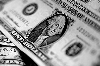 http://www.design-and-photography.com/
"Untitled" by Ralph Kerpa
I chose this picture because it's original. I've never seen a picture of a money bill, before, so this one caught my interest. The contrast is really excellent, and there is barely ANY gray. I think that a hard light was used to take this picture, because the contrast came out so well. I also like how close-up the photographer got to the dollar bill, to make it seem more interesting.
About Ralph Kerpa:
Ralph Kerpa is a photographer who owns a large photography studio. He was born near Hamburg in 1965, and he began to be interested in photography in the 80's. He is known for taking pictures that make an impression and leave a mark.
 http://lonnatucker.com/
"Approaching storms" by Lonna Tucker
I chose this picture because it amazed me when I first saw it. The landscape is beautiful, the contrast excellent and it is focused everywhere. I love the effect that the clouds give, they look very imposing and vast. The plants on the bottom half of the picture add texture, and the rolling hills with the forest (or rocks?) in the back bring this photograph close to perfection. The lighting is amazing, it looks like this picture was taken in the late afternoon.
About Lonna Tucker:
Lonna Tucker is a commercial photographer who is based in Tempe Arizona. She sells her photographs to many big tourism companies such as Hilton Resorts, America West Airlines, and Fuji Film. She has done this for over 20 years, and she mostly works with landscapes, golfscapes, and classic cars.
During this project I didn't have many problems in the darkroom. I had to get accustomed to my new work station, which is in a darker place than mine from last year. My negatives were very good for the most part, so I didn't have many problems printing my pictures. On my first portrait, I worked with the picture to get more texture and to balance the contrast, and I ended up using a low filter. For my second portrait I had a "chemical problem". Strange ripples and dots appeared on my negatives, and there was no way to get rid of them. I printed the picture nonetheless, and It came out fine (It's better to look at it from a distance). For this picture and the next 2 also, I used a very high filter (4.5) to get the effect and the contrast that I needed. I loved the contrast that I got in the first portrait (pumpkin centretable) and the second portrait (roses centretable). For these last two I basically used the same settings as the ones before, just adjusting the aperture and increasing the time.
For the landscapes I worked with a medium filter and very different apertures: 11 for the morning shot and 2.8 for the evening shot. I loved all these prints and was very satisfied with my improvement from last year. Overall, everything in the darkroom ran smoothly, even though I had to get used to waiting longer for prints to go through the developing process, since we were using fiber-based paper. The advantage of this paper was that by monitoring how long a print stays in the developer, you could make an image darker or lighter, and this quality of the paper really helped the contrast on my prints!
Theory Notes:
Hard Light:
Hard light is light that is pointed directly at the subject. There will be dark shadows because of it, and it will usually create a lot of contrast in the picture, because only part of the subject will me illuminated. This creates a very dramatic effect, that can be manipulated by the photographer to create a picture that looks strong or angry.
Soft Light:
Soft light is light that has been diffused or it is indirect. Soft light is used when you want the subject to be lit more evenly, and less shadows (less defined) will be created. Because of this, the image will appear softer, and less texture will be shown, so less imperfections will be seen.
Three-Point Lighting:
Three-point lighting is when you combine hard light and soft light to create a natural effect. It is used a lot by professionals, and it consists of one hard (key) light that points directly at the face, a diffused (fill) light that softens up the picture by making imperfections less detailed, and a backlight, that is placed behind the subject so that they will appear more separated from the background.
http://www.cybercollege.com/
As you see, the subject is in front of the backlight and behind the hard and soft lights.
The following is an example of a picture taken with three-point lighting:
http://www.cybercollege.com/
As you see, the light is distributed evenly but it is not too soft, and the subject stands out because of the back light.
Printing Compositions: *click on images to inlarge them*
Portrait I: hard light
The main challenge with this print was getting enough detail without losing the special effect that the hard light gave. I started out with no filter and an 8 aperture (test strip 1), but the pictures looked milky and not detailed enough. The contrast was fabulous with the more open apertures, like 5.6 (t.s. 2), but the picture overall was too dark and still not detailed enough. So in the end I kept the 4 filter and the 8 aperture, with a time of 20 seconds (print 1).
test strip 1: A:8 ; T:10 ; F:none
test strip 2: A:5.6 ; T:26 ; F:4
print 1: A:8 ; T:20 ; F:4
Portrait II: natural light
This portrait had strange dots and ripples that I was unable to take out. I worked with high filters to give her a more "stone" -ish appearance. I started out with an 8 aperture and a medium filter (test strip 3), which gave me quite a nice image, but too "soft" and somewhat light. I tried to go darker, but still I wasn't satisfied with the result, so I changed the filter to a higher one and played with the time (t.s. 4 and 5) until I got the perfect settings for my final print (print 2).
test strip 3: A:8 ; T:15 ; F:2.5
test strip 4: A:8 ; T:35 ; F:4.5
test strip 5: A:8 ; T:45 ; F:4.5
print 2: A:8 ; T:40 ; F:4.5
Still Life I: "hard" natural light
This print has "hard" light because of the striking contrast between the areas of light and no light, even though the lighting was natural. For this print, I wanted to have as much contrast as possible to show the amazing light effect. I started out with a 4 aperture and a low time (test strip 6) but I got something horribly grey and dark! So I closed the aperture to 8 and inserted a high filter (t.s. 7) but still the picture didn't have as much contrast as I wanted. To get this contrast I closed the aperture even more to 11, and tried different times (t.s. 8) until I realized that the best time was 45 seconds (print 3).
test strip 6: A:4 ; T:5 ; F:none
test strip 7: A:8 ; T:11 ; F:4.5
test strip 8: A:40 ; T:40-35-30 left to right ; F:4.5
print 3: A:11 ; T:45 ; F:4.5
Still Life II: "soft" natural light
This print has "soft" light because the light is more evenly spread out among the subject, with no areas of total white or total black. The image seems softer because of this. For this print, I was again concentrating on contrast and detail. I started out with simial settings as the first still life, just a lower time (test strip 9), but the contrast wasn't very good. So I increased the time to 40 seconds (t.s. 10) and eventually decided to go to 45 seconds for my final print (print 4).
test strip 9: A:11 ; T:25 ; F:4.5
test strip 10: A:11 ; T:40 ; F:4.5
print 4: A:11 ; T:45 ; F:4.5
Landscape I: morning natural light
This picture was taken around 9 in the morning, which accounts for the long shadows seen in it. My main focus for this print was to have the right balance of whites and blacks, and therefore a good contrast. I started out with trying two different apertures, 4 and 8, and the same time (test strip 11). Neither of these was very successful, one being almost completely black, so I tried closing up the aperture and increasing the time (t.s. 12), but I still wasn't satisfied with the contrast. So I inserted a medium filter and went back to the 8 aperture (t.s. 13) and I was quite happy with the results, since I thought there was enough contrast. Therefore, for my final print I increased the time by two seconds and got a contrast which I was satisfied with, and an image which I thought represented the morning light well (print 5).
test strip 11: A:4-8 left to right ; T:20 ; F:none
test strip 12: A:11 ; T:25 ; F:none
test strip 13: A:8 ; T:18 ; F:2.5
print 5: A:8 ; T:20 ; F:2.5
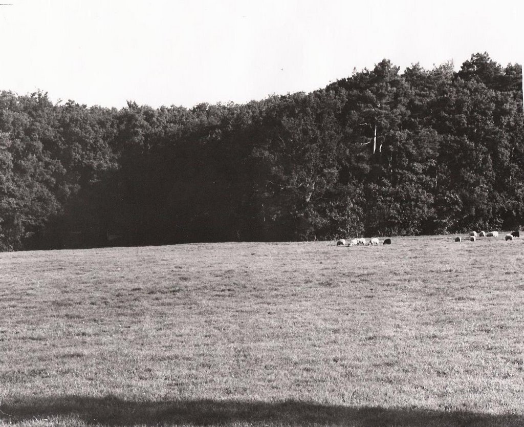
Landscape II: evening natural light
This picture was taken around 6 in the afternoon. You can see that the sun is low in the sky by noticing the shadows that the trees create. I was worried that this picture would be too dark, but in the end I was happy with the final print. I started out with the same settings as the previous landscape (test strip 14) but I got a picture with way too much white! So I opened up the aperture all the way, kept the same filter and tried different times (t.s. 15) to see if it would improve. For my final print I just increased the time a bit, to 15 seconds, and I was satisfied with the contrast beween the trees and the sky, and with the reflection on the trees in the lake (print 6).
test strip 14: A:8 ; T:20 ; F:2.5
test strip 15: A:2.8 ; T:8-10-12 left to right ; F:2.5
print 6: A:2.8 ; T:15 ; F:2.5
Image Bank:
 http://www.eoloperfido.com/
"Elena" by Eolo Perfido.
I chose this picture because it's a beautiful portrait that must have taken a long time to get right. I like how the artist shows the person's reflection, making them look like they are deep in thought or daydreaming. I think this picture has character, and it wouldn't be this beautiful without excellent lighting done by the photographer. It looks like the lighting may be natural, coming from the other side of the "glass" or window.
About Eolo Perfido:
Eolo Perfido was born in France in 1972, and started working with photography at the age of 28. Most of his pictures are portraits of people, and he is working on improving his skills further. He now lives and works in Rome.
 http://www.design-and-photography.com/
"Untitled" by Ralph Kerpa
I chose this picture because it's original. I've never seen a picture of a money bill, before, so this one caught my interest. The contrast is really excellent, and there is barely ANY gray. I think that a hard light was used to take this picture, because the contrast came out so well. I also like how close-up the photographer got to the dollar bill, to make it seem more interesting.
About Ralph Kerpa:
Ralph Kerpa is a photographer who owns a large photography studio. He was born near Hamburg in 1965, and he began to be interested in photography in the 80's. He is known for taking pictures that make an impression and leave a mark.
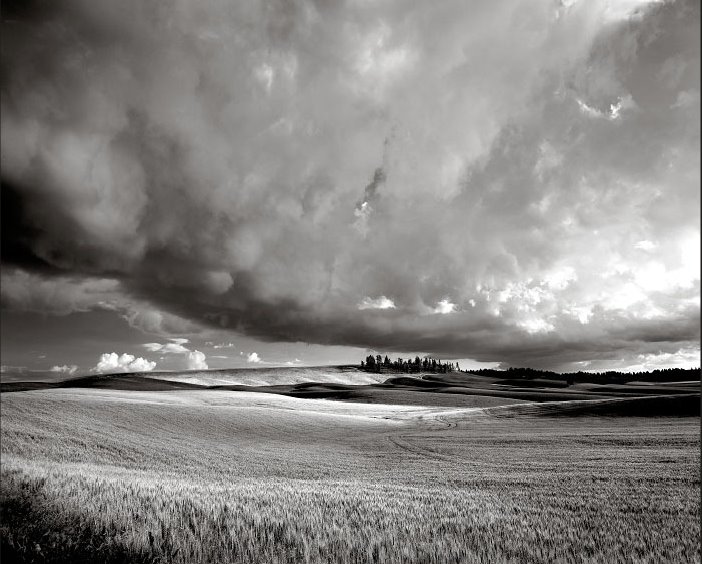 http://lonnatucker.com/
"Approaching storms" by Lonna Tucker
I chose this picture because it amazed me when I first saw it. The landscape is beautiful, the contrast excellent and it is focused everywhere. I love the effect that the clouds give, they look very imposing and vast. The plants on the bottom half of the picture add texture, and the rolling hills with the forest (or rocks?) in the back bring this photograph close to perfection. The lighting is amazing, it looks like this picture was taken in the late afternoon.
About Lonna Tucker:
Lonna Tucker is a commercial photographer who is based in Tempe Arizona. She sells her photographs to many big tourism companies such as Hilton Resorts, America West Airlines, and Fuji Film. She has done this for over 20 years, and she mostly works with landscapes, golfscapes, and classic cars.
Oh, such a beautiful blog my fellow photographer!
Posted by Anonymous |
5:32 PM
Anonymous |
5:32 PM