Lighting Part III : Hair
Diary Entry:
I didn't have many problems in the dark room during this project. The printing went quickly, and I moved from one print to the next smoothly. The only challenge I had was picking the right images at the beginning of the project. I had to make sure that the image fit the project requirement and that I would be able to work with it.
Some of my pictures were too dark, or too grey so I could not print them. After I picked the ones I liked the most, everything followed, and my main opjective was to get as much contrast as I could. I found that this was difficult for the print with two people in it, because of the different skin tones. To get a better color on one face, the other would come out to be too dark or too light. I was happy with the texture that the hair (especially the blond hair) added to the prints, and I tried to make it stand out as much as possible. Mostly for this project I used very high filters, which helped my contrast and added to the texture.
Theory Notes:
Using a flash:
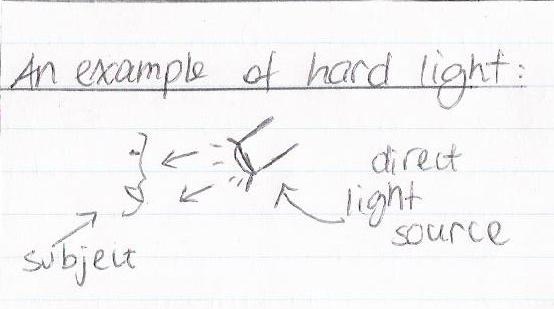
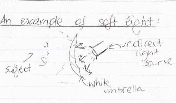
Flash is important in photography because, when used right, it can give excellent results. A flash can be used when there is too little light, and the photographer wants to make the picture lighter, or when there is an area of too much light, and the photographer wants to illuminate the subject and make it stand out from the background. The best way to use a flash is to move it so that the light bounces off a wall, ceiling, or white umbrella. This technique is used to light the subject from different angles, and it can really add a lot of contrast if done the right way, as you can see from the image below.
 http://www.shortcourses.com/
As you see, the best-looking picture results from the flash reflected on the ceiling, with the light coming from the top. It creates shadows on the statue that create more contrast. Perhaps, on a person the light effect desired would be different, but rotating the flash (in this case, obviously an external one) clearly produces a better image. Flash is very useful to fill in hard shadows, but it can also be useful to balance the light in a picture.
 http://www.shortcourses.com/
In the picture above, you can see that the light coming in from the window is very bright, which results in a darker background and especially darker subjects. To counteract this, one could use a flash. The flash, as you see in the picture below, lights up the subject and the background, and makes the subject stand out.
 http://www.shortcourses.com/
Using a light meter:
Light meters are devices that photographers use to measure the light before they take a picture. The light meter will detect the average light reflected from the subject and will provide shutter and aperture settings accordingly. Light meters are useful because they supply settings that would otherwise be hard to find by the photographer alone. Sometimes though, one wants a fast shutter speed or a low aperture. This may not be what the light meter tells you, so you will have to change the settings to get the best results. You may have to add seconds or lower the aperture, but in the end using a light meter will give better results than simply estimating settings for an image.
Printing Compositions: *click on images to enlarge them*
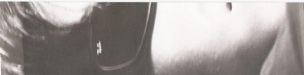
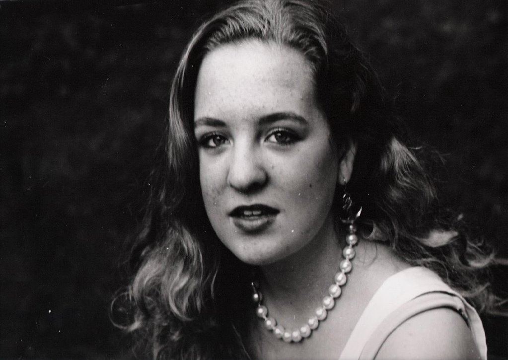
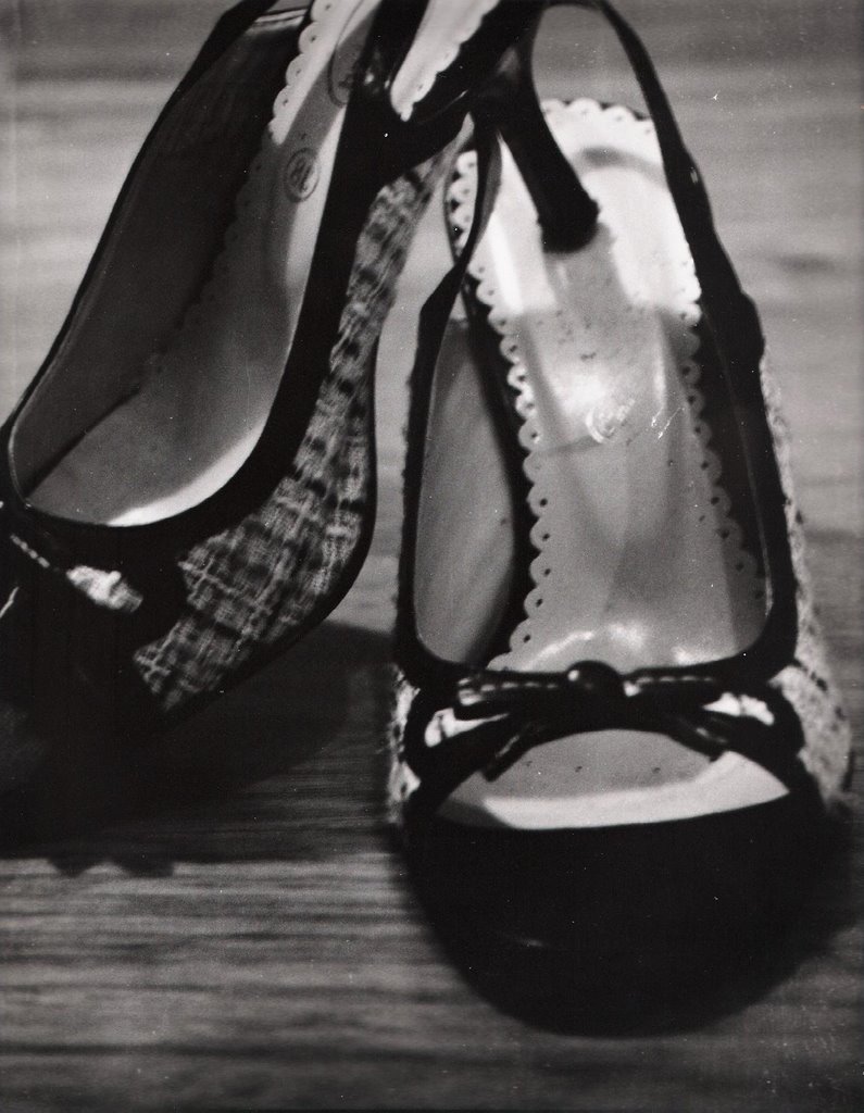
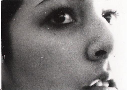
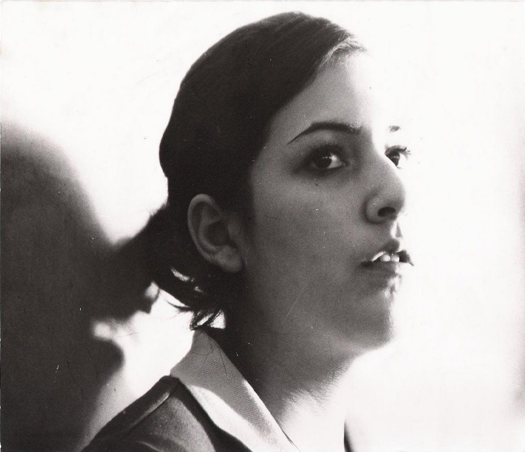
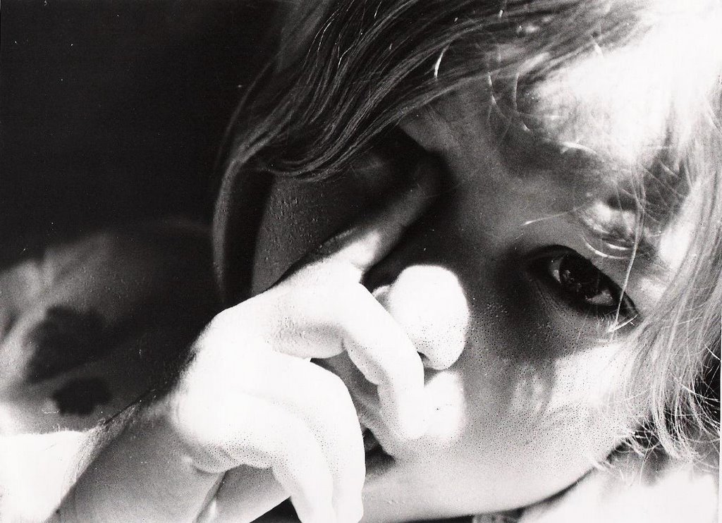
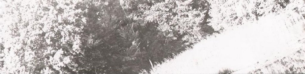
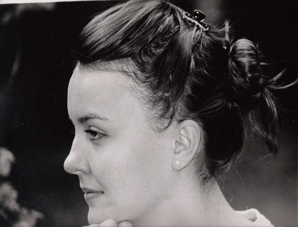
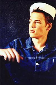
Hair I: flash, outdoors; close-up shot
For this print, I wanted a lot of contrast and detail in the hair. To achieve this, I started with a low filter and an 8 aperture (t.s. 1 and 2), but they looked too grey (t.s. 3). Since I wanter more contrast, I messed around with the filter and time until I reached the result that I wanted. I ended up increasing the filter to 3, and the time to 43 for my final print. I was very happy with the detail and the texture that I obtained.
test strip 1: A:8 ; T:8 ; F:2

test strip 2: A:8 ; T:14-12-10 ; F:2

test strip 3: A:8 ; T:14 ; F:2

print 1: A:8 ; T:43 ; F:3

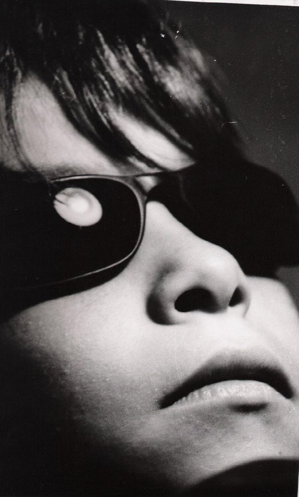
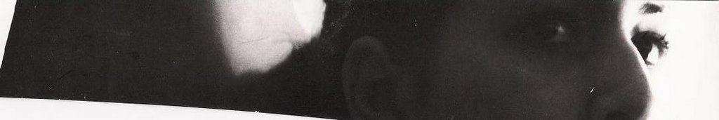
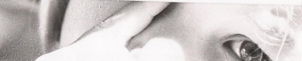
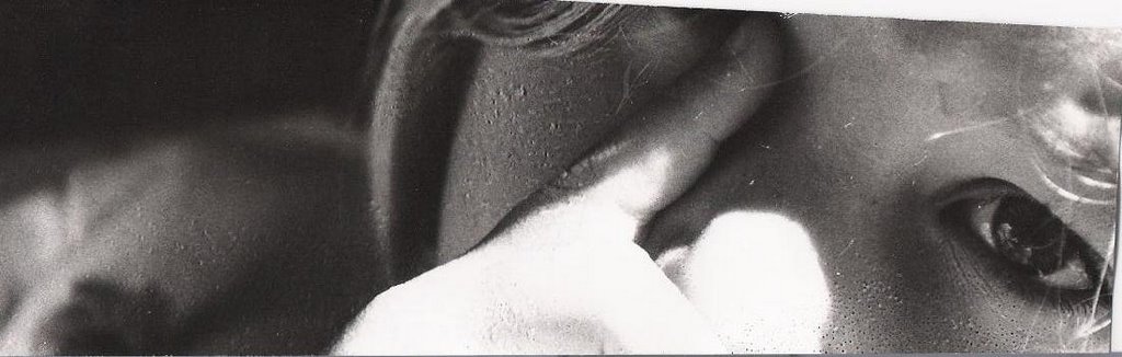
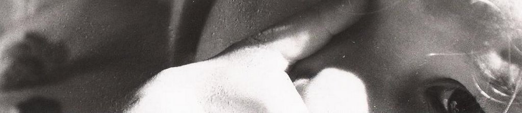
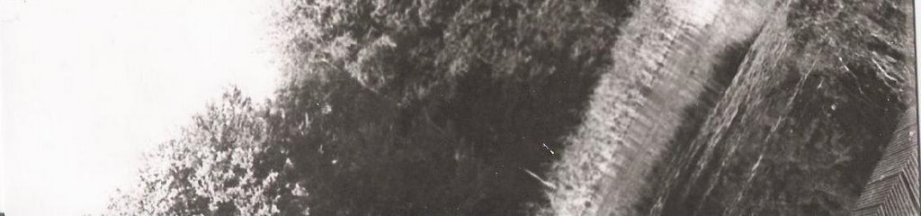
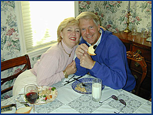
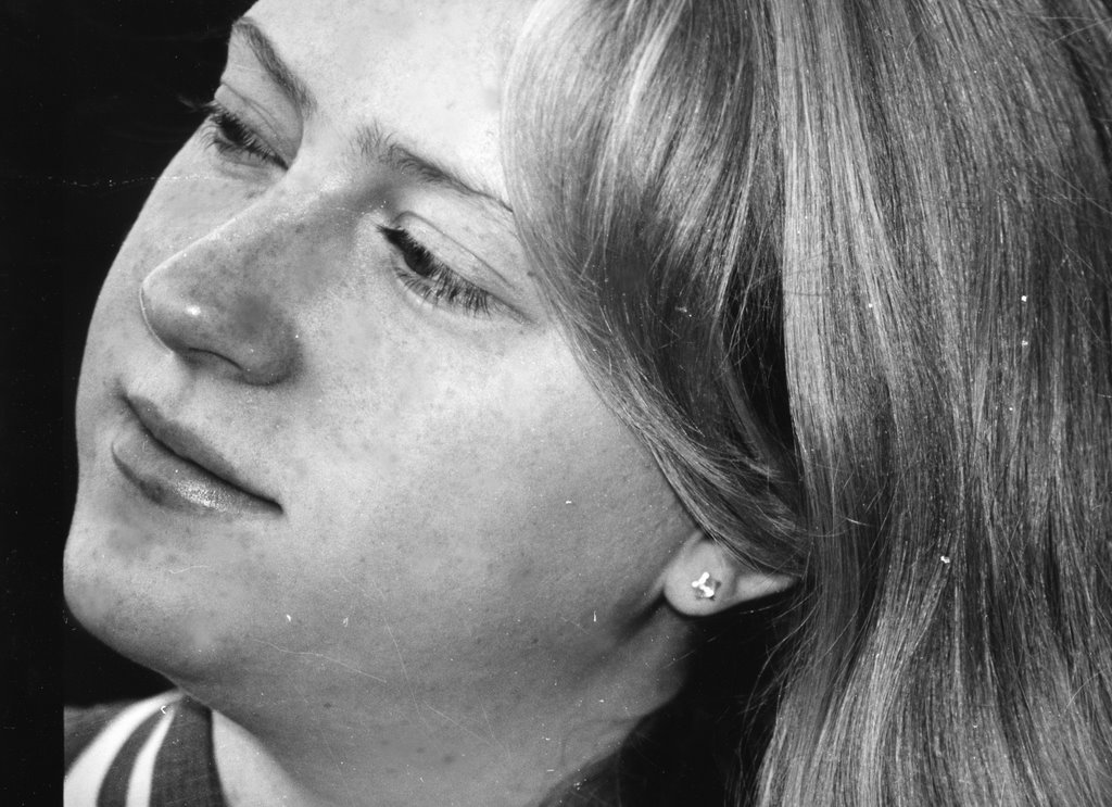
Hair II: flash, outdoors; angle shot
This portrait was special because of the texture that the hair adds, and this was what I concentrated on. My first test strip (t. s. 5) was obviously too dark, so I decided to close the aperture to 11 and increase the filter to 5 (t.s. 6).... but now the picture was too light! I tried increasing the time (t.s. 7), but the picture was still too light and I wasn't getting enough detail and contrast. Therefore, I decided to go back to the 8 aperture and decrease the time, leaving the high filter (t.s. 8). I liked this much better, because I could see enough detail and texture. So, for my final print, I increased the time to 34 and kept all the other settings.
test strip 4: A:8 ; T:27 ; F:3.5
test strip 5: A:11 ; T:33 ; F:5

test strip 6: A:11 ; T:45 ; F:5

test strip 7: A:8 ; T:27 ; F:5

print 2: A:8 ; T:34 ; F:5

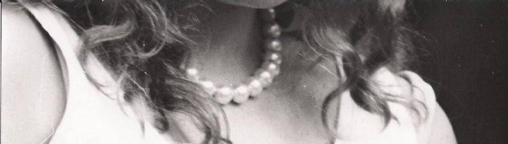
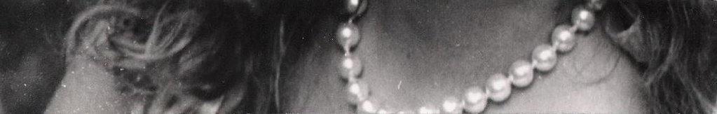
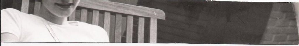
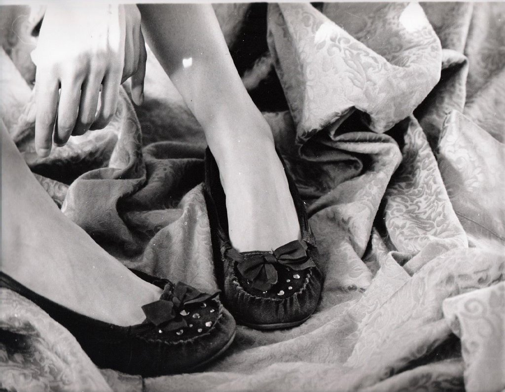
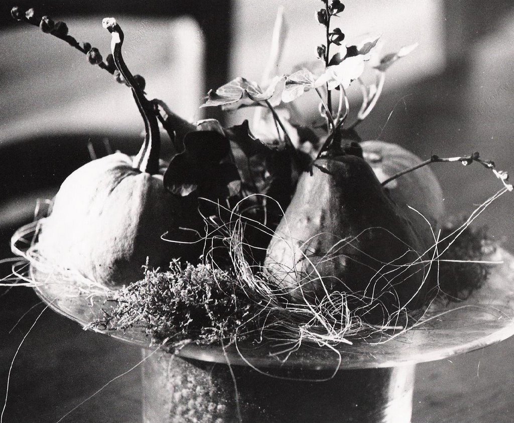
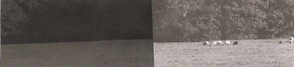
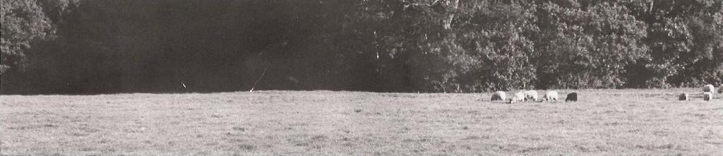
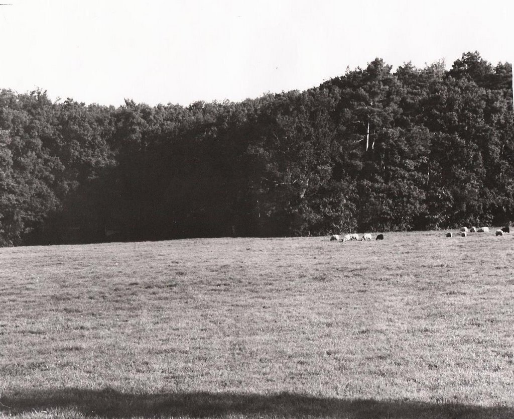
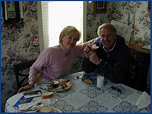
Hair III: flash, outdoors; multiple subjects
This print was very similar to the last one, with the exact same light settings. Therefore, I only had to add time to make this picture perfect, and it fit my needs exactly because the contrast and texture were good. My only problem was balancing the time so that neither skintone looked to light/dark, and in the end I managed to get a result that I was happy with. So for the final print I increased the time to 42 and kept all the other settings.
print 3: A:8 ; T:42 ; F:5

Image Bank:
 http://www.evelynmontes.com/
"Untitled" by Evelyn Montes.
I like the non-chalant pose in this picture, which gives it a more cozy (less run-way) look. It's not your usual head-to-shoulder (a bit below the shoulder) photograph, and therefore adds to its uniqueness. The lighting is good, putting in focus the head and hair of the subject. The subject's expression leaves you wondering what he's looking at, which is a pleasing quality of this photograph.
About Evelyn Montes:
Evelyn Montes is a fashion photographer who owns an agency in South Beach, Florida. She started out as a make-up and hair artist, and then decided to become a photographer. She specializes in making portfolios and comp cards for different models in different Miami modeling agencies.
 http://www.striffler.com/
"Untitled" by Eric Striffler
I like this picture's slightly blurred feel, which helps capture the subject's emotion: laughter in this case. Even though the picture is a bit too gray, the light is diffused and evenly distributed, so no hard shadows are visible. This photograph's best quality is the angle it has been shot from. By taking the picture from above the subject, the photographer has made this picture more interesting and more keen to catching the attention of viewers.
About Eric Striffler:
Eric Striffler is a photographer who works in New York City, Miami, the Hamptons, and the Caribbean. He has been a fashion, interior, and lifestyle photographer for over 10 years. His advertising and editorial photographs have appeared in many publications, including Businessweek, Vogue, W, and Elle. His photographs have also appeared in galleries and multimedia presentations. He is praised and admired by his colleagues and fellow photographers.
 http://www.cartright.com/
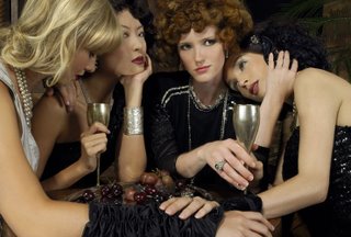
"Untitled" by Joseph Cartright
I chose this picture mainly because it has multiple subjects in it, but after examining for a while I fell in love with its atmosphere and facial expressions. The little details on the plate and the jewelry add so much to the composition, filling up space with interesting things. The artist manages to 'advertise' four hairstyles in one frame and still surprise and please the viewer instead of boring him. The poses are interesting and somewhat unconventional, and therefore attract people's interest. Even the facial expressions are captivating, and the smile-smirk-glare of the center subject makes me laugh. I love the dark-victorian feel to the clothes and jewelery and the simple hairstyles.
About Joseph Cartright:
Joseph Cartright is a beauty, lifestyle, and fashion photographer based in New York City. He has been favoring and encouraging the use of a digital camera ever since its first invention, in the 1980s. Together with his large portfolio, Cartright keeps and unpdated blog on his personal website, through which he shares his opinions on anything... from photography to Japanese cars.
I didn't have many problems in the dark room during this project. The printing went quickly, and I moved from one print to the next smoothly. The only challenge I had was picking the right images at the beginning of the project. I had to make sure that the image fit the project requirement and that I would be able to work with it.
Some of my pictures were too dark, or too grey so I could not print them. After I picked the ones I liked the most, everything followed, and my main opjective was to get as much contrast as I could. I found that this was difficult for the print with two people in it, because of the different skin tones. To get a better color on one face, the other would come out to be too dark or too light. I was happy with the texture that the hair (especially the blond hair) added to the prints, and I tried to make it stand out as much as possible. Mostly for this project I used very high filters, which helped my contrast and added to the texture.
Theory Notes:
Using a flash:
Flash is important in photography because, when used right, it can give excellent results. A flash can be used when there is too little light, and the photographer wants to make the picture lighter, or when there is an area of too much light, and the photographer wants to illuminate the subject and make it stand out from the background. The best way to use a flash is to move it so that the light bounces off a wall, ceiling, or white umbrella. This technique is used to light the subject from different angles, and it can really add a lot of contrast if done the right way, as you can see from the image below.
 http://www.shortcourses.com/
 As you see, the best-looking picture results from the flash reflected on the ceiling, with the light coming from the top. It creates shadows on the statue that create more contrast. Perhaps, on a person the light effect desired would be different, but rotating the flash (in this case, obviously an external one) clearly produces a better image. Flash is very useful to fill in hard shadows, but it can also be useful to balance the light in a picture.
 http://www.shortcourses.com/
 In the picture above, you can see that the light coming in from the window is very bright, which results in a darker background and especially darker subjects. To counteract this, one could use a flash. The flash, as you see in the picture below, lights up the subject and the background, and makes the subject stand out.
 http://www.shortcourses.com/
 Using a light meter:
Light meters are devices that photographers use to measure the light before they take a picture. The light meter will detect the average light reflected from the subject and will provide shutter and aperture settings accordingly. Light meters are useful because they supply settings that would otherwise be hard to find by the photographer alone. Sometimes though, one wants a fast shutter speed or a low aperture. This may not be what the light meter tells you, so you will have to change the settings to get the best results. You may have to add seconds or lower the aperture, but in the end using a light meter will give better results than simply estimating settings for an image.
Printing Compositions: *click on images to enlarge them*
Hair I: flash, outdoors; close-up shot
For this print, I wanted a lot of contrast and detail in the hair. To achieve this, I started with a low filter and an 8 aperture (t.s. 1 and 2), but they looked too grey (t.s. 3). Since I wanter more contrast, I messed around with the filter and time until I reached the result that I wanted. I ended up increasing the filter to 3, and the time to 43 for my final print. I was very happy with the detail and the texture that I obtained.
test strip 1: A:8 ; T:8 ; F:2

test strip 2: A:8 ; T:14-12-10 ; F:2

test strip 3: A:8 ; T:14 ; F:2

print 1: A:8 ; T:43 ; F:3
Hair II: flash, outdoors; angle shot
This portrait was special because of the texture that the hair adds, and this was what I concentrated on. My first test strip (t. s. 5) was obviously too dark, so I decided to close the aperture to 11 and increase the filter to 5 (t.s. 6).... but now the picture was too light! I tried increasing the time (t.s. 7), but the picture was still too light and I wasn't getting enough detail and contrast. Therefore, I decided to go back to the 8 aperture and decrease the time, leaving the high filter (t.s. 8). I liked this much better, because I could see enough detail and texture. So, for my final print, I increased the time to 34 and kept all the other settings.
test strip 4: A:8 ; T:27 ; F:3.5

test strip 5: A:11 ; T:33 ; F:5

test strip 6: A:11 ; T:45 ; F:5
test strip 7: A:8 ; T:27 ; F:5
print 2: A:8 ; T:34 ; F:5
Hair III: flash, outdoors; multiple subjects
This print was very similar to the last one, with the exact same light settings. Therefore, I only had to add time to make this picture perfect, and it fit my needs exactly because the contrast and texture were good. My only problem was balancing the time so that neither skintone looked to light/dark, and in the end I managed to get a result that I was happy with. So for the final print I increased the time to 42 and kept all the other settings.
print 3: A:8 ; T:42 ; F:5

Image Bank:
 http://www.evelynmontes.com/
"Untitled" by Evelyn Montes.
I like the non-chalant pose in this picture, which gives it a more cozy (less run-way) look. It's not your usual head-to-shoulder (a bit below the shoulder) photograph, and therefore adds to its uniqueness. The lighting is good, putting in focus the head and hair of the subject. The subject's expression leaves you wondering what he's looking at, which is a pleasing quality of this photograph.
About Evelyn Montes:
Evelyn Montes is a fashion photographer who owns an agency in South Beach, Florida. She started out as a make-up and hair artist, and then decided to become a photographer. She specializes in making portfolios and comp cards for different models in different Miami modeling agencies.
 http://www.striffler.com/
"Untitled" by Eric Striffler
I like this picture's slightly blurred feel, which helps capture the subject's emotion: laughter in this case. Even though the picture is a bit too gray, the light is diffused and evenly distributed, so no hard shadows are visible. This photograph's best quality is the angle it has been shot from. By taking the picture from above the subject, the photographer has made this picture more interesting and more keen to catching the attention of viewers.
About Eric Striffler:
Eric Striffler is a photographer who works in New York City, Miami, the Hamptons, and the Caribbean. He has been a fashion, interior, and lifestyle photographer for over 10 years. His advertising and editorial photographs have appeared in many publications, including Businessweek, Vogue, W, and Elle. His photographs have also appeared in galleries and multimedia presentations. He is praised and admired by his colleagues and fellow photographers.
 http://www.cartright.com/
"Untitled" by Joseph Cartright
I chose this picture mainly because it has multiple subjects in it, but after examining for a while I fell in love with its atmosphere and facial expressions. The little details on the plate and the jewelry add so much to the composition, filling up space with interesting things. The artist manages to 'advertise' four hairstyles in one frame and still surprise and please the viewer instead of boring him. The poses are interesting and somewhat unconventional, and therefore attract people's interest. Even the facial expressions are captivating, and the smile-smirk-glare of the center subject makes me laugh. I love the dark-victorian feel to the clothes and jewelery and the simple hairstyles.
About Joseph Cartright:
Joseph Cartright is a beauty, lifestyle, and fashion photographer based in New York City. He has been favoring and encouraging the use of a digital camera ever since its first invention, in the 1980s. Together with his large portfolio, Cartright keeps and unpdated blog on his personal website, through which he shares his opinions on anything... from photography to Japanese cars.