Composition
Diary Entry:
This project was quick and simple, so I didn't have any major problems in the darkroom. I started out with fiber based warm tone paper, and since my picture didn't have much contrast to start with, it was very hard to get what I wanted. The sepia look of the paper spoiled the effect that I wanted the picture to give because it softened it. Because the times of exposure were getting much higher than I would have wished (around 80 seconds), I switched to another type of paper, a more glossy fiber based by another brand. I was very pleased with the results, especially the contrast.
Theory Notes:
Composition:
The one characteristic that sets and image apart from others is composition. Using composition the phographer can manipulate how he or she wants the image to be viewed.
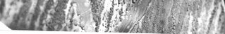
One of the most important composition techniques is simplicity. As you see in the example below, a crowded background can take attention away from your subject and ruin the image. Changing your point of view, closing up into the subject (cropping), leaving the background plain, and using a small depth of field are all ways you can make your photographs more simple.

http://photoinf.com
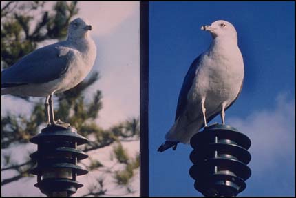
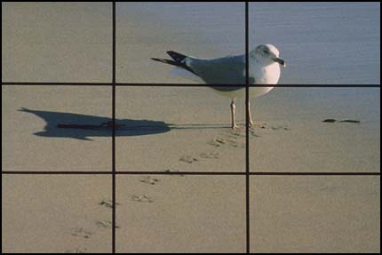
Another technique that many photographers use is the rule of thirds. This method consists of placing the subject and all the objects in your image according to a grid that divides the field of view into 9 spaces. As you see below, the goal of the photographer is to place the objects either in one of these areas or in the space where two lines intersect. This enhances the picture and makes it more interesting. An important thing to remember while using this technique is that the image should be as balanced as possible. Shapes and objects should be arranged so that the objects balance each other out.
 http://photoinf.com

Lastly, a technique that photographers use to add dynamics and interest to an image is lines. S-shaped, curved, and diagonal lines all contribute to making the image easy to look at and pleasing to the eye. As you can see in the example below, the lines alone can make the image more interesting.

Printing Compositions: *click on images to enlarge them*
Gloss:
For this print, I wanted a lot of contrast so that the heart would be visible. I started with a high filter and a low aperture,
but I wasn't completely happy with what I got, so I raised the filter to 5 and I opened my aperture more. What I got was better, but the sepia look of the paper took away from the effect I wanted the image to give. I switched paper to glossy, and tried my same settings, and I was very pleased with what I got. The contrast was perfect, it made the image more striking and harsh.
test strip 1: A:4 ; T:50-55-60 ; F:4.5

test strip 2: A:2.8 ; T:35-40-45 ; F:2
print 1: A:2.8 ; T:50 ; F:5

Image Bank:
http://www.nyclondon.com/
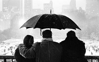
"Wollman Ice Rink, Central Park" by Rob Gardiner.
I like this picture because of its composition, its contrast, and the way it reminds me of winter. Composition-wise, it is perfect. The background is blurred out, the subjects centered but placed in the lowed third of the image, with the umbrella on the top two thirds. The viewer is attracted to the center of the image, and the rest doesn't take away from it, but instead complements it. The contrast is appalling, because I wish my pictures would be more like that.
About Rob Gardiner:
Rob Gardiner is a New York based potographer that owns the famous photography site NYCLondon. He usually prints in black and white, and he uses a variety of different formats. He likes to take pictures of things that hit him particularly. Other times, he tries to find the beauty "below the surface" of things that are normally prejudiced as ugly. He likes the challenge of confronting these prejudices and emerging with beautiful prints.
This project was quick and simple, so I didn't have any major problems in the darkroom. I started out with fiber based warm tone paper, and since my picture didn't have much contrast to start with, it was very hard to get what I wanted. The sepia look of the paper spoiled the effect that I wanted the picture to give because it softened it. Because the times of exposure were getting much higher than I would have wished (around 80 seconds), I switched to another type of paper, a more glossy fiber based by another brand. I was very pleased with the results, especially the contrast.
Theory Notes:
Composition:
The one characteristic that sets and image apart from others is composition. Using composition the phographer can manipulate how he or she wants the image to be viewed.
One of the most important composition techniques is simplicity. As you see in the example below, a crowded background can take attention away from your subject and ruin the image. Changing your point of view, closing up into the subject (cropping), leaving the background plain, and using a small depth of field are all ways you can make your photographs more simple.
http://photoinf.com
Another technique that many photographers use is the rule of thirds. This method consists of placing the subject and all the objects in your image according to a grid that divides the field of view into 9 spaces. As you see below, the goal of the photographer is to place the objects either in one of these areas or in the space where two lines intersect. This enhances the picture and makes it more interesting. An important thing to remember while using this technique is that the image should be as balanced as possible. Shapes and objects should be arranged so that the objects balance each other out.
 http://photoinf.com
Lastly, a technique that photographers use to add dynamics and interest to an image is lines. S-shaped, curved, and diagonal lines all contribute to making the image easy to look at and pleasing to the eye. As you can see in the example below, the lines alone can make the image more interesting.

Printing Compositions: *click on images to enlarge them*
Gloss:
For this print, I wanted a lot of contrast so that the heart would be visible. I started with a high filter and a low aperture,
but I wasn't completely happy with what I got, so I raised the filter to 5 and I opened my aperture more. What I got was better, but the sepia look of the paper took away from the effect I wanted the image to give. I switched paper to glossy, and tried my same settings, and I was very pleased with what I got. The contrast was perfect, it made the image more striking and harsh.
test strip 1: A:4 ; T:50-55-60 ; F:4.5

test strip 2: A:2.8 ; T:35-40-45 ; F:2

print 1: A:2.8 ; T:50 ; F:5

Image Bank:

http://www.nyclondon.com/
"Wollman Ice Rink, Central Park" by Rob Gardiner.
I like this picture because of its composition, its contrast, and the way it reminds me of winter. Composition-wise, it is perfect. The background is blurred out, the subjects centered but placed in the lowed third of the image, with the umbrella on the top two thirds. The viewer is attracted to the center of the image, and the rest doesn't take away from it, but instead complements it. The contrast is appalling, because I wish my pictures would be more like that.
About Rob Gardiner:
Rob Gardiner is a New York based potographer that owns the famous photography site NYCLondon. He usually prints in black and white, and he uses a variety of different formats. He likes to take pictures of things that hit him particularly. Other times, he tries to find the beauty "below the surface" of things that are normally prejudiced as ugly. He likes the challenge of confronting these prejudices and emerging with beautiful prints.