Monday, April 02, 2007

Motion

Diary Entry:

This project was done digitally, so I had no occasion to work in the dark room. I worked with Photoshop and learnt many new techniques, including super-imposing. It took quite some time to get accustomed to the process, but once I did I was able to work with other images quickly. My main print was composed of two images, superimposed to give the illusion of motion in a girl's jump. I was pleased with the result and later moved onto another print, composed of four images of a boy kicking a ball, superimposed to show the evolution of the kick. I used different filters and such things to give this image different feels and make it more interesting, and then mounted three different effects together. It was the first time I worked with this kind of image, so I was very happy with my outcome.


Theory Notes:

Motion:

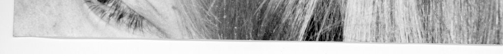
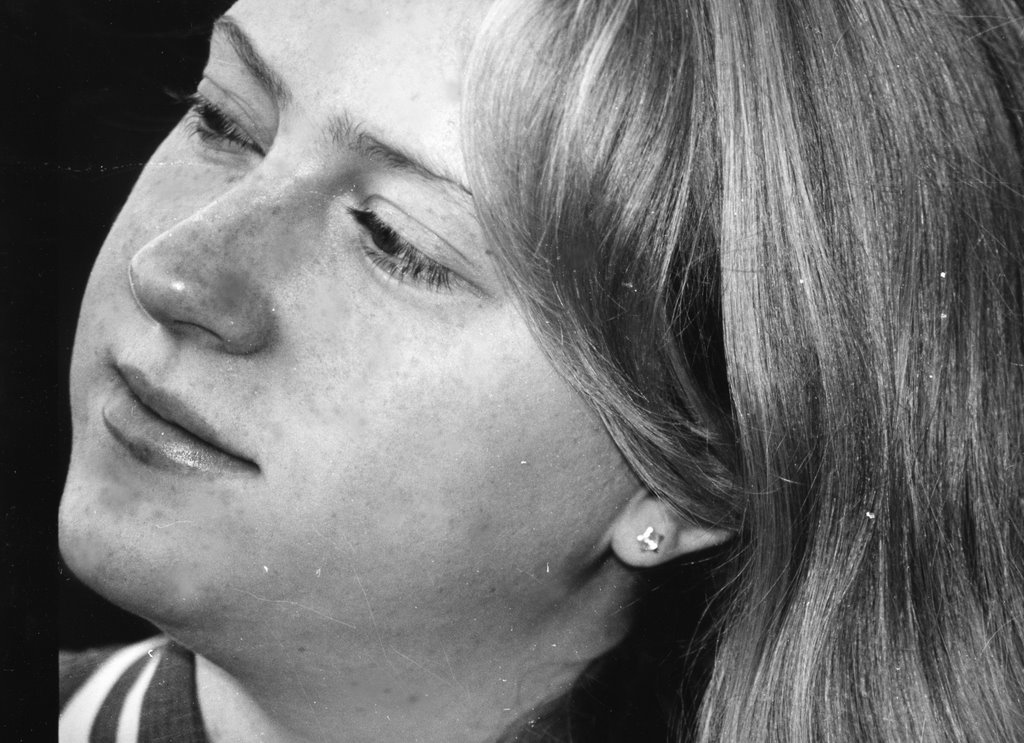
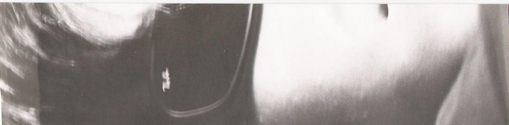
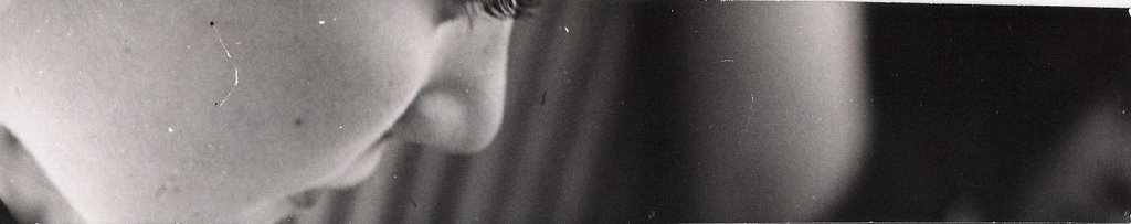
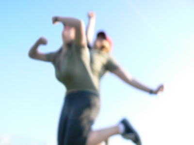
There are several ways to obtain the effect of motion in a photograph. One results from having a slow shutter speed, which blurs the moving subject and therefore makes it look like it is in movement. An example of this is my first motion print, or the image below.

image by Karin Dolinsek

In this image, the subjects are not in focus, they are blurry, and the reader gets the impression of their movement. Again, this can be accomplished by using a slow shutter speed, such as 1/60.

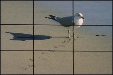
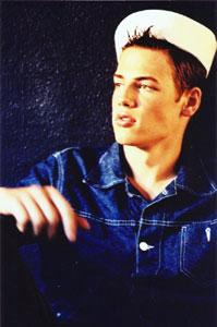
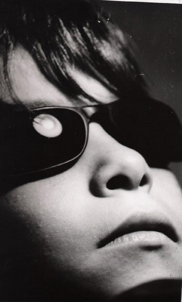
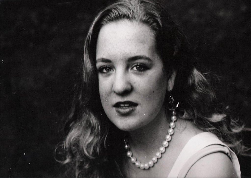
Another way to give the impression of movement effectively is using a very fast shutter speed, which captures the subject and may or may not blur the background. A fast film speed (ISO) also helps, like 400 or 800. A blurry background is the best choice, because with this the subject looks like it is moving at a faster speed. At other times, a normal background may be suitable as well, as you can see in the image below.


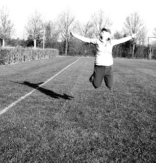
In this picture, the shutter speed was fast enough (around 1/1000) to capture the girl's jump. Thus she appears caught in the air, suspended.

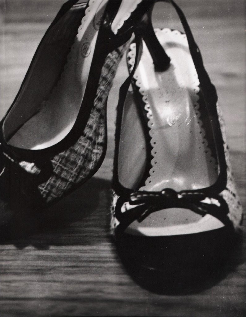
A third way of expressing motion is superimposing pictures of differents stages of an action to show its movement. This can be done using an image editor such as Photoshop. An example of this technique is my second motion print below.


print 1:

This print is composed of two different images taken at low shutter speed, superimposed to give the effect of motion. The second image was cropped at the hip to fit exactly over the original image.


print 2:

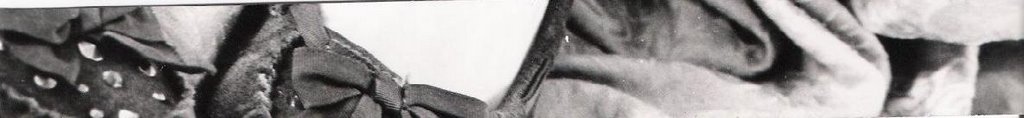
This print is composed of four different images taken at high shutter speed, superimposed to give the impression of motion and seen under various artistic filters.
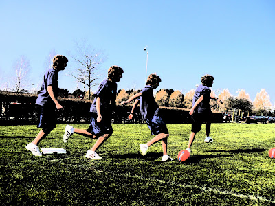
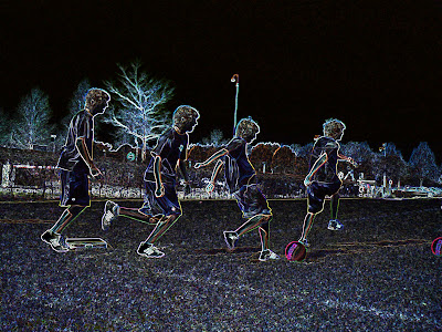


Image Bank:

http://www.agathegaillard.com/

"Densmore Shute Bends the Shaft 1938" by Harold Edgerton.

I love this picture because I find it amazing that the swing could be so minutely photographed and its shape be so perfect. By looking at the photograph I can imagine precisely what the swing looked like in real life. The dynamics in this image really make it stand out and appeal to viewers, who remained awed.

About Harold Edgerton:

Edgerton was an American engineer who invented the stroboscope, "a device which uses a rapidly flashing light to take a rapid series of pictures at rates of up to 2000 frames per second" (http://scienceworld.wolfram.com/biography/Edgerton.html). This device was used to engineering purposes as well as photography, with which it produced amazing results. Edgerton was a professor at MIT for over 40 years, and he used the stroposcope to illustrate motion in different situation. He is known for his "time-stopping," and his images are breathtaking.


http://www.julianopie.com/

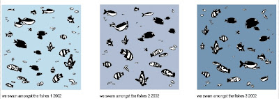
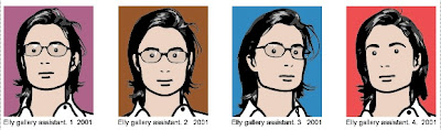
"We swam amongst the fishes 1-3" and "Elly gallery assistant 1-4" by Julian Opie.


I like these images because they are simple and straightforward. The bright colors make them appealing and interesting. Opie uses different colors as background to give each similar image a different feel. This is similar to what I did with my second series, using different filters and techniques.

About Julian Opie:

Julian Opie is a London-born British artist who is known for his colorful art. His art is simple but symbolic, and it is appreciated by many all over the world. His work has won awards and been exposed in countless one-person and group exhibitions. Many of his paintings can also be found in public collections such as the Tate Gallery in London, the Museum of Modern Art in New York, and the British Museum.


Monday, March 05, 2007

Contemporary Photograph from Painting

Diary Entry:

This project was done digitally, so I had no occasion to work in the dark room. The process went smoothly, and taking pictures wasn't hard except for getting the right lighting. The picture was taken inside at night with a bright artificial light, instead of during the day in front of a bright window like I had planned. This was no problem because I could easily adjust both contrast and brightness using Photoshop. I learned how to manipulate my picture with different applications like curves, filters, saturation, etc. I also used the burning, dodging, and color picking tools to adjust the colors in the picture the way I wanted them. I like the apparently "messy" parts of the picture, where the added effects can be seen, because they make the photograph look more like a painting, which was the object of the project.


Theory Notes:

Composition of the painting:


"Young Girl Reading" by Jean-Honoré Fragonard, a French painter of the 18th century. He was part of the French "rococo" era, which came after the baroque style, with the reign of Louis XV. The style of this era can be described as "light, elaborate and decorative" (http://www.artcyclopedia.com).

In his painting, the girl seems to be glowing. This is caused by the light gently flooding her face and clothes. It puts her in the center of attention, and immediately brings the viewer's eye to it. The colors are soft, and this fits with the light mood of the era. The flowing material, curling ribbons, plump pillows, and ruffles add detail and interest. This is very much part of the artist's style, which is characterised by "sensual" strokes that communicate his pleasure of painting and his great mastery of it. The dark background serves as somewhat of a border to the subject, and frames it with at touch of added contrast which enhances the whole. The grace shown by the posture, hand, clothes, and hair demonstrate an elegance which can only be represented by a high-standing girl, and the reader gets this impression. The colors overall reflect the decorative and light mood imposed by the era, and the warmth and brightness of the yellow seem to represent the girl's youth or bright character. One can imagine a window facing opposite her, with rays of sunlight from a sunset or dawn streaming in. Overall, the piece is very balanced: the girl is centered, and the darkness above her and to the left are complemented by teh lighter pillow area in the bottom and right.

Contemporary Version:

For this print, I wanted the photograph to look like a more contemporary version of Fragonard's painting. I used a scarf in place of the ornate collar that the girl wears, and my model wore a monochrome shirt just like the painting's subject. I then added a bow in her hair, a more modern version of a simple ribbon. I added necklaces and ribbon hanging from her neck to decorate and add to the "busy" part of the picture below her collar. I kept the idea of pillows behind her back, but chose a modern print to add contemporaneity.

print 1:


Image Bank:

http://www.stephendean.com/

"Untitled" by Roy Weinstein.

The little boy in this image reminds me of my brother. I like the different colors, which create a striking contrast which is pleasing and at the same time very interesting. The colors are plain, and the simplicity of the painting adds to its value. You can see that the artist has first taken a photograph, and then used different techniques to paint a replica of it, adding more style and color.

About Roy Weinstein:

Roy Weinstein is a photographer who also makes paintings from photographs.
He has worked in the areas of newsphotography, fashion, portrait, still life, and fine art, and is a member of the National Press Photographers. He has tried to expand his ideas and work with new tachniques, as you can see from the image above.
"A former Graphic Artist, Roy believes a good photographer must synthenize all the elements surrounding the subject. The result in Roy's case is a true marriage of art and technology" (http://www.photographerusa.com). His images have been published in many different magazines and newspapers throughout the years.


http://www.stephendean.com/

"Target" by Stephen Dean.

I chose this picture because it is a photograph that looks like a painting. I like the patterns that are created by all the different colors, and the photograph definitely attracts a lot of attention.

About Stephen Dean:

This artist is knows for turning everyday objects into beautiful artwork. He was born in Paris in 1968 and now lives and works in New York and Paris. He experiments with recycled objects, newspapers, and many other things to create different compositions, and his photographs often look like they have been painted.

Thursday, January 25, 2007

Composition

Diary Entry:

This project was quick and simple, so I didn't have any major problems in the darkroom. I started out with fiber based warm tone paper, and since my picture didn't have much contrast to start with, it was very hard to get what I wanted. The sepia look of the paper spoiled the effect that I wanted the picture to give because it softened it. Because the times of exposure were getting much higher than I would have wished (around 80 seconds), I switched to another type of paper, a more glossy fiber based by another brand. I was very pleased with the results, especially the contrast.


Theory Notes:

Composition:

The one characteristic that sets and image apart from others is composition. Using composition the phographer can manipulate how he or she wants the image to be viewed.
One of the most important composition techniques is simplicity. As you see in the example below, a crowded background can take attention away from your subject and ruin the image. Changing your point of view, closing up into the subject (cropping), leaving the background plain, and using a small depth of field are all ways you can make your photographs more simple.


http://photoinf.com

Another technique that many photographers use is the rule of thirds. This method consists of placing the subject and all the objects in your image according to a grid that divides the field of view into 9 spaces. As you see below, the goal of the photographer is to place the objects either in one of these areas or in the space where two lines intersect. This enhances the picture and makes it more interesting. An important thing to remember while using this technique is that the image should be as balanced as possible. Shapes and objects should be arranged so that the objects balance each other out.

http://photoinf.com


Lastly, a technique that photographers use to add dynamics and interest to an image is lines. S-shaped, curved, and diagonal lines all contribute to making the image easy to look at and pleasing to the eye. As you can see in the example below, the lines alone can make the image more interesting.


Printing Compositions: *click on images to enlarge them*

Gloss:

For this print, I wanted a lot of contrast so that the heart would be visible. I started with a high filter and a low aperture,
but I wasn't completely happy with what I got, so I raised the filter to 5 and I opened my aperture more. What I got was better, but the sepia look of the paper took away from the effect I wanted the image to give. I switched paper to glossy, and tried my same settings, and I was very pleased with what I got. The contrast was perfect, it made the image more striking and harsh.

test strip 1: A:4 ; T:50-55-60 ; F:4.5


test strip 2: A:2.8 ; T:35-40-45 ; F:2


print 1: A:2.8 ; T:50 ; F:5


Image Bank:


http://www.nyclondon.com/


"Wollman Ice Rink, Central Park" by Rob Gardiner.

I like this picture because of its composition, its contrast, and the way it reminds me of winter. Composition-wise, it is perfect. The background is blurred out, the subjects centered but placed in the lowed third of the image, with the umbrella on the top two thirds. The viewer is attracted to the center of the image, and the rest doesn't take away from it, but instead complements it. The contrast is appalling, because I wish my pictures would be more like that.

About Rob Gardiner:

Rob Gardiner is a New York based potographer that owns the famous photography site NYCLondon. He usually prints in black and white, and he uses a variety of different formats. He likes to take pictures of things that hit him particularly. Other times, he tries to find the beauty "below the surface" of things that are normally prejudiced as ugly. He likes the challenge of confronting these prejudices and emerging with beautiful prints.

Monday, September 25, 2006

Lighting Part III : Hair

Diary Entry:

I didn't have many problems in the dark room during this project. The printing went quickly, and I moved from one print to the next smoothly. The only challenge I had was picking the right images at the beginning of the project. I had to make sure that the image fit the project requirement and that I would be able to work with it.
Some of my pictures were too dark, or too grey so I could not print them. After I picked the ones I liked the most, everything followed, and my main opjective was to get as much contrast as I could. I found that this was difficult for the print with two people in it, because of the different skin tones. To get a better color on one face, the other would come out to be too dark or too light. I was happy with the texture that the hair (especially the blond hair) added to the prints, and I tried to make it stand out as much as possible. Mostly for this project I used very high filters, which helped my contrast and added to the texture.


Theory Notes:

Using a flash:

Flash is important in photography because, when used right, it can give excellent results. A flash can be used when there is too little light, and the photographer wants to make the picture lighter, or when there is an area of too much light, and the photographer wants to illuminate the subject and make it stand out from the background. The best way to use a flash is to move it so that the light bounces off a wall, ceiling, or white umbrella. This technique is used to light the subject from different angles, and it can really add a lot of contrast if done the right way, as you can see from the image below.

http://www.shortcourses.com/

As you see, the best-looking picture results from the flash reflected on the ceiling, with the light coming from the top. It creates shadows on the statue that create more contrast. Perhaps, on a person the light effect desired would be different, but rotating the flash (in this case, obviously an external one) clearly produces a better image. Flash is very useful to fill in hard shadows, but it can also be useful to balance the light in a picture.

http://www.shortcourses.com/

In the picture above, you can see that the light coming in from the window is very bright, which results in a darker background and especially darker subjects. To counteract this, one could use a flash. The flash, as you see in the picture below, lights up the subject and the background, and makes the subject stand out.

http://www.shortcourses.com/


Using a light meter:

Light meters are devices that photographers use to measure the light before they take a picture. The light meter will detect the average light reflected from the subject and will provide shutter and aperture settings accordingly. Light meters are useful because they supply settings that would otherwise be hard to find by the photographer alone. Sometimes though, one wants a fast shutter speed or a low aperture. This may not be what the light meter tells you, so you will have to change the settings to get the best results. You may have to add seconds or lower the aperture, but in the end using a light meter will give better results than simply estimating settings for an image.


Printing Compositions: *click on images to enlarge them*

Hair I: flash, outdoors; close-up shot

For this print, I wanted a lot of contrast and detail in the hair. To achieve this, I started with a low filter and an 8 aperture (t.s. 1 and 2), but they looked too grey (t.s. 3). Since I wanter more contrast, I messed around with the filter and time until I reached the result that I wanted. I ended up increasing the filter to 3, and the time to 43 for my final print. I was very happy with the detail and the texture that I obtained.

test strip 1: A:8 ; T:8 ; F:2


test strip 2: A:8 ; T:14-12-10 ; F:2


test strip 3: A:8 ; T:14 ; F:2


print 1: A:8 ; T:43 ; F:3


Hair II: flash, outdoors; angle shot

This portrait was special because of the texture that the hair adds, and this was what I concentrated on. My first test strip (t. s. 5) was obviously too dark, so I decided to close the aperture to 11 and increase the filter to 5 (t.s. 6).... but now the picture was too light! I tried increasing the time (t.s. 7), but the picture was still too light and I wasn't getting enough detail and contrast. Therefore, I decided to go back to the 8 aperture and decrease the time, leaving the high filter (t.s. 8). I liked this much better, because I could see enough detail and texture. So, for my final print, I increased the time to 34 and kept all the other settings.

test strip 4: A:8 ; T:27 ; F:3.5


test strip 5: A:11 ; T:33 ; F:5


test strip 6: A:11 ; T:45 ; F:5


test strip 7: A:8 ; T:27 ; F:5


print 2: A:8 ; T:34 ; F:5


Hair III: flash, outdoors; multiple subjects

This print was very similar to the last one, with the exact same light settings. Therefore, I only had to add time to make this picture perfect, and it fit my needs exactly because the contrast and texture were good. My only problem was balancing the time so that neither skintone looked to light/dark, and in the end I managed to get a result that I was happy with. So for the final print I increased the time to 42 and kept all the other settings.

print 3: A:8 ; T:42 ; F:5


Image Bank:

http://www.evelynmontes.com/

"Untitled" by Evelyn Montes.
I like the non-chalant pose in this picture, which gives it a more cozy (less run-way) look. It's not your usual head-to-shoulder (a bit below the shoulder) photograph, and therefore adds to its uniqueness. The lighting is good, putting in focus the head and hair of the subject. The subject's expression leaves you wondering what he's looking at, which is a pleasing quality of this photograph.

About Evelyn Montes:
Evelyn Montes is a fashion photographer who owns an agency in South Beach, Florida. She started out as a make-up and hair artist, and then decided to become a photographer. She specializes in making portfolios and comp cards for different models in different Miami modeling agencies.


http://www.striffler.com/

"Untitled" by Eric Striffler
I like this picture's slightly blurred feel, which helps capture the subject's emotion: laughter in this case. Even though the picture is a bit too gray, the light is diffused and evenly distributed, so no hard shadows are visible. This photograph's best quality is the angle it has been shot from. By taking the picture from above the subject, the photographer has made this picture more interesting and more keen to catching the attention of viewers.

About Eric Striffler:
Eric Striffler is a photographer who works in New York City, Miami, the Hamptons, and the Caribbean. He has been a fashion, interior, and lifestyle photographer for over 10 years. His advertising and editorial photographs have appeared in many publications, including Businessweek, Vogue, W, and Elle. His photographs have also appeared in galleries and multimedia presentations. He is praised and admired by his colleagues and fellow photographers.


http://www.cartright.com/

"Untitled" by Joseph Cartright
I chose this picture mainly because it has multiple subjects in it, but after examining for a while I fell in love with its atmosphere and facial expressions. The little details on the plate and the jewelry add so much to the composition, filling up space with interesting things. The artist manages to 'advertise' four hairstyles in one frame and still surprise and please the viewer instead of boring him. The poses are interesting and somewhat unconventional, and therefore attract people's interest. Even the facial expressions are captivating, and the smile-smirk-glare of the center subject makes me laugh. I love the dark-victorian feel to the clothes and jewelery and the simple hairstyles.

About Joseph Cartright:
Joseph Cartright is a beauty, lifestyle, and fashion photographer based in New York City. He has been favoring and encouraging the use of a digital camera ever since its first invention, in the 1980s. Together with his large portfolio, Cartright keeps and unpdated blog on his personal website, through which he shares his opinions on anything... from photography to Japanese cars.

Lighting Part II : Fashion Photography

Diary Entry:

This project was long but very successful. I learned to really quicken my pace by working faster or by using two enlargers at a time. By doing this I could work on two prints at the same time, and I would always be busy, never waiting for something to develop. I also gained some more independence when my teacher was absent from school for a week. During this week I often had to make my own judgement call on the quality of my print and whether I should change the settings. I worked fast and was able to produce many prints even though I was working by myself. I didn't have any problems with my prints except some scratches that I hope to be able to fill in soon. During this project I experimented with filters a lot, especially to get more contrast in my clothes pictures. For some of these I used a filter as high as 5!! I'm happy with all of my prints, even though I wish I had a greater variety of clothing for my clothes pictures. My main challenge or this project was to make sure that the viewer understands which item is being 'advertised'. Therefore, for some of these is made the background very dark or increased the contrast to make the item stand out. The best part of this project was when the developer suddenly started to work extremely fast, and pictures developed in less than 15 seconds. Time flew. Keeping up with everything suddenly became a bit harder, but I managed to get four prints done in one lesson. The main reason why I worked fast during this project was that the lighting situations in which I took the pictures were all very similar, so once I got the first couple of prints right, most of the others had similar settings. Something that I should pay more attention two during the next project is minimizing the risk of scratches on my prints by not "stabbing" them while in the solutions, and by being careful when picking them up. The last thing I'd like to work on is getting prints that are more in focus by always using a tripod and making sure that the subject is perfectly in focus.


Theory Notes:

Shooting in Sunlight:

The Sun is the best and least expensive light source: it's free and you never have to carry it around with you! When the Sun is bright, you can get photographs with a lot of contrast, similar to having a hard light. If the Sun isn't as bright, the light will be more diffused and you will get more of a soft light effect. The most important thing to remember whilst shooting outdoors using the Sun is the time of day. Around noon, the Sun is high up in the sky, and the light is shining down onto the subject. This can create problems, such as dark dark shadows on the face of the subject (especially under eyes), and the subjects squinting because the light is too bright. On the other hand, shooting when the sun is low (early morning or late afternoon) will eliminate these problems. The disadvantage with shooting when the sky is low is that the light is mroe diffused and less strong, so there may be a loss of contrast.
To deal with the disadvantages, photographers use some tricks to shoot in bright sunlight. Some may place subjects in a white tent on a very sunny day, resulting in the light being bright and diffused. Others will try to shoot with the bright sunlight behind the subject, to reduce the face shadows and to eliminate any possible squinting.

Shooting in Low Light:

"Low light" is when you have to compensate for the lack of light in a situation. The tricks are the following: One, you could try to use a flash. A good flash (especially if it is external), will light up the subject so that the part of the subject facing it won't have shadows. The farther away your subject is, though, the less effective the flash will be. Two, you can try different shutter speeds. If there is little light, you want a slow shutter speed (1/30 , 1/20 ... depending on the film speed). The slower the film speed, the more light will expose the film. The only problem with this technique is that the shutter speed may to too slow to shoot subjects in movement, and the pictures may come out blurry (a tripod should always be used when working with slow shutter speeds). Three, you can play with the aperture. Just like the shutter speed can be used to expose the film more, the aperture can be opened to let in more light. For this, you can use an open aperture like 2.8. Four, you can use a high ISO. The higher the speed of your film is, the lighter your pictures will be. The only disadvantage with this is that as the film speed increases, the graininess of the picture also does.


Printing Compositions: *click on images to enlarge them*

Accessories I: hard light from a lamp

My goal for this print was to get perfect contrast. I knew that in order for the picture to strike the viewer. So when I got a milky result (test strip 1), I immediately increased the time, and kept the other settings. After several trials, I reached the 35-45 seconds, and I liked the contrast, so I printed my final print at 43 seconds (print 1). I was happy with the pitch black background and the marble-like texture of the subject's face. The only detail I would change is the reflection of the lamp in the glasses!

test strip 1: A:8 ; T:17 ; F:3


test strip 2: A:8 ; T:35-40-45 ; F:3


print 1: A:8 ; T:43 ; F:3


Accessories II: low sunlight

For this accessory, I initially started out with a different image. This image, which can be partly seen in test strips 3 and 4, ended up being worst, compositionally, than another one, so I kept my settings and printed the other one. I started with a very grey test strip (test strip 3) [very strange settings..], and after some trials, I found better-looking settings, which were completely different from the ones I started with. A lower time, a smaller aperture, and a medium filter did the trick. But I still wasn't content with the contrast, so I added a higher filter and I slightly increased the time (t.s. 5). I was happy with this test strip, so I kept those settings for my final print (print 2).

test strip 3: A:2.8 ; T:40 ; F:none


test strip 4: A:5.6 ; T:13 ; F:2.5


test strip 5: A:5.6; T:18 ; F:5


print 2: A:5.6 ; T:18 ; F:5


Accessories III: low sunlight

For this print, I started out with a 2.8 aperture and a low time of 8 seconds (test strip 6). I was happy with how it looked, and thought I would get enough contrast. This image went really quickly, and I kept those settings and was done with the final print (print 3) before long.

test strip 6: A:2.8 ; T:8 ; F:none


print 3: A:2.8 ; T:10 ; F:none


Clothes I: low sunlight

My first attempt was way too gray (test strip 7), so I increased the time to 30 seconds, hoping to get more blacks. What I got was better (t.s. 8), but I increased the aperture to 5.6 and returned to 20 seconds for my final print (print 4), which gave me more contrast. The worst thing about this picture is the background, which is dark grey and boring: couldn't get it to have any more contrast!

test strip 7: A:2.8 ; T:30 ; F:4.5


test strip 8: A:2.8; T:20 ; F:4.5


print 4: A5.6 ; T:20 ; F:4.5


Clothes II: low sunlight

The main problem with this print, like the last one, was the bad background. My goal was to make it dark enough so it wouldn't take the attention away from the subject. My first test strip (test strip 9) was too light, it didn't have enough any black. So I opened the aperture to 5.6 and halved the time to 15... (t.s. 10 after some trials).. but I wanted more details in the shirt so I realized I had to go even darker, to 20 seconds (t.s. 11). I liked these settings the best, so I kept them and slightly lowered the time for my final print (print 5). As I was working on more than one print, I accidentally left this print in the developer for more time, and I got a very dark picture. The, bringing into the light, I realized that the darkness worked to my advantage, blacking out the bacground and putting the subject in focus.

test strip 9: A:8; T:30 ; F:5


test strip 10: A:5.6 ; T:15 ; F:5


test strip 11: A:5.6 ; T:20 ; F:5


print 5: A:5.6 ; T:18 ; F:5 5+ minutes in developer


Clothes III: low sunlight

This picture was taken around 6 in the afternoon. You can see that the sun is low in the sky by noticing the shadows that the trees create. I was worried that this picture would be too dark, but in the end I was happy with the final print. I started out with the same settings as the previous landscape (test strip 14) but I got a picture with way too much white! So I opened up the aperture all the way, kept the same filter and tried different times (t.s. 15) to see if it would improve. For my final print I just increased the time a bit, to 15 seconds, and I was satisfied with the contrast beween the trees and the sky, and with the reflection on the trees in the lake (print 6).

test strip 12: A:5.6 ; T:12 ; F:5


print 6: A:5.6 ; T:16 ; F:5


Shoes I: hard light from lamp

This picture was taken around 6 in the afternoon. You can see that the sun is low in the sky by noticing the shadows that the trees create. I was worried that this picture would be too dark, but in the end I was happy with the final print. I started out with the same settings as the previous landscape (test strip 14) but I got a picture with way too much white! So I opened up the aperture all the way, kept the same filter and tried different times (t.s. 15) to see if it would improve. For my final print I just increased the time a bit, to 15 seconds, and I was satisfied with the contrast beween the trees and the sky, and with the reflection on the trees in the lake (print 6).

test strip 13: (both) A:8 ; T:15 ; F:3


print 7: A:8 ; T:12 ; F:3


Shoes II: soft sunlight

This picture was taken around 6 in the afternoon. You can see that the sun is low in the sky by noticing the shadows that the trees create. I was worried that this picture would be too dark, but in the end I was happy with the final print. I started out with the same settings as the previous landscape (test strip 14) but I got a picture with way too much white! So I opened up the aperture all the way, kept the same filter and tried different times (t.s. 15) to see if it would improve. For my final print I just increased the time a bit, to 15 seconds, and I was satisfied with the contrast beween the trees and the sky, and with the reflection on the trees in the lake (print 6).

test strip 14: A:5.6; T:6 ; F:2


test strip 15: A:5.6 ; T:7 ; F:2


print 8: A:5.6 ; T:7.5. ; F:2


Shoes III: soft sunlight

This picture was taken around 6 in the afternoon. You can see that the sun is low in the sky by noticing the shadows that the trees create. I was worried that this picture would be too dark, but in the end I was happy with the final print. I started out with the same settings as the previous landscape (test strip 14) but I got a picture with way too much white! So I opened up the aperture all the way, kept the same filter and tried different times (t.s. 15) to see if it would improve. For my final print I just increased the time a bit, to 15 seconds, and I was satisfied with the contrast beween the trees and the sky, and with the reflection on the trees in the lake (print 6).

test strip 16: A:5.6 ; T:7; F:2


print 9: A:5.6 ; T:7 ; F:2


Image Bank:

http://www.yanickdery.com/

"Untitled" by Yanick Dery.
I love this picture! The lighting is perfect, making the subject more interesting and the dress more appealing. The background chosen is unusual, and therefore grabs the attention of the viewer. The model's pose is also unusual, but it gives the photograph an informal feel, not cold like many fashion photographs are. This picture spreads warmth instead, and makes the viewer curious about what the model is laughing at and pointing at.

About Yanick Dery:
Yanick Dery is a fashion and beauty photographer who has been studying art since he was 16. He has traveled all around the world and has worked for various magazines. He now has a studios in Montreal and in New York, and he now lives in New York.


http://www.mullerphoto.com/

"Untitled" by Michael Muller
I chose this picture because it's interesting and unique. I like how the water is perfectly in focus and the subject seems like he's in motion. Still, the focus is on the goggles, the accessory being advertised. The colors, even though blurred, make this image special and interesting.

About Michael Muller:
Michael Muller is a talented photographer who captivates viewers by using very unusual poses. His images are usually colorful and upbeat, and he has worked for numerous companies and brands, for example Speedo for this picture. He became famous at 16 with some of his snowboarding images. Since then, he has taken some extraordinary photographs that we may even be familiar with, by seeing them in magazines and advertisements.


http://www.demarchelier.net/

I chose this picture because it is clear what the artist wanted to advertise. The poses are great and the angle from which the artist took the picture makes it, again, unique and interesting. The contrast is good and the composition is capturing. I like the fact that it is black and white instead of color, like usual magazine pictures.

About Patrick Demarchelier:
Patrick Demarchelier is one of the most famous fashion photographers, born in 1943. He started his career in Paris and then moved to New York in 1975. He worked for international and luxurious companies like Tiffany's, Armani, Calvin Klein, L'Oreal, and Chanel, and photographed V.I.P.s such as Princess Diana (he was her official photographer, the only non-british photographer to ever photograph the royal family). Demarchelier worked for top magazines such as Vogue and Harper's Bazaar.